1. Home
  2. Reporting
  3. The Clutch Report Catalog
  4. The Mobile Communication Report

The Mobile Communication Report

The Mobile Communication Report can be found in the Reporting section of the Next Gen Portal. It allows you to view mobile performance and filter by time, segment, message, and more to identify top-performing content and areas for improvement.

Be sure you have an Account Group selected or applied to your user in order to view all of the reports. Click within each section to learn more about each aspect of the report.

Comparison

This determines the date range that is compared against the Selected Period. You’ll be able to compare the previous period or the previous year. 

The date range determines the dates used for the Selected Period. The default date range is the past month from the current date.

If selecting Vs Previous Period, note that:

  • The Previous Period’s End Date is the Selected Start Date minus 1 day.
  • The Previous Period’s Start Date is the Previous Period’s End Date minus the number of days you selected for your range.
  • The number of days selected for your range will be the Selected End Date minus the Selected Start Date:

If selecting Vs Previous Year:

  • The Previous Year Start Date is the Selected Start Date – 365 Days.
  • The Previous Year End Date is the Selected End Date – 365 Days.

Filters

You’ll be able to target specific data within your report by using the available filters on top. These filters include:

Filter recipients by segment.

Filter messages by communication tag. Please note the ability to create tags is only available in our legacy platform at this time.

Filter by message.

Filter messages by schedule type.

Filter recipients by STO group.

Filter messages by marketing type. Please note that Legacy Portal reporting is filtered for Marketing Only by default.

Filter messages by message type.

Once you have the filters you want in place, click the Update button to update your report.

Metric Definitions

The total number of text messages sent.

The total number of text messages sent using Short Message Service.

The total number of text messages sent using Multimedia Messaging Service.

The total number of text messages successfully delivered.

The number of Deliveries divided by Sends.

The total number of clicks.

 The total number of recipients that clicked.

The number of Unique Clicks divided by Deliveries.

The number of opt-outs from mobile programs.

The number of Opt-Outs divided by Deliveries.

 This calculates the percent difference between the Selected Period and the Comparison Period.

[(The Selected Period Value – Comparison Period Value) / Comparison Period Value x 100%].

Performance Over Time Chart

This chart will plot the chosen metric over time breakouts determined by the period dropdown for both the Selected and Comparison Periods. Metrics can also be individually toggled in the legend.

You’ll be able to adjust the chart via:

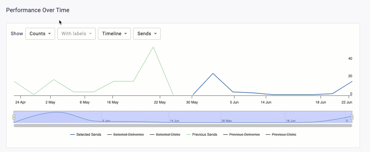
You can determine which metric options appear in the Metric dropdown between Counts and Rates.

Counts Include

  • Sends
  • Deliveries
  • Clicks
  • All

Rates Include

  • Delivery
  • Click
  • All

Labels

You can determine if data labels appear on the chart by selecting with or without labels.

Note that this input is disabled in the Timeline view because data labels are not supported by that graph type.

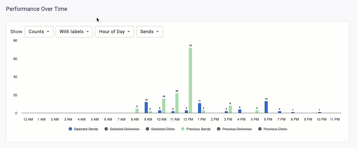
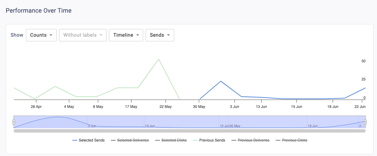
You can determine the graph type and time grouping for the data.
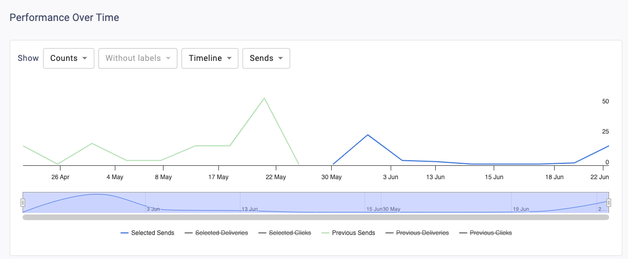
Timeline
This displays a trend-over-time chart that plots metrics by day. The bar on the bottom of the chart can zoom in or out to different date ranges on the timeline.
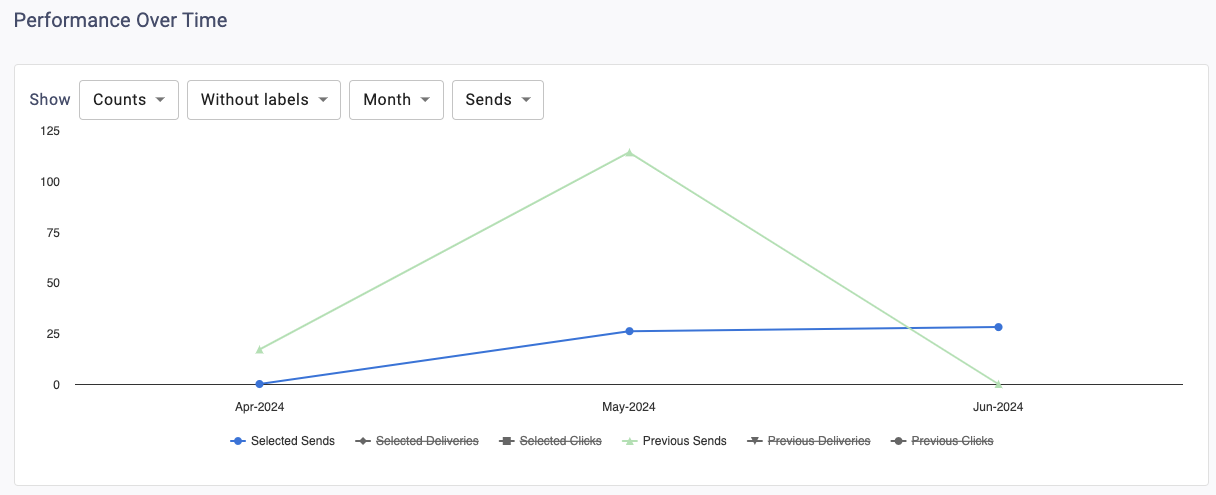
Month
This displays a trend over time chart that summarizes metrics by month.
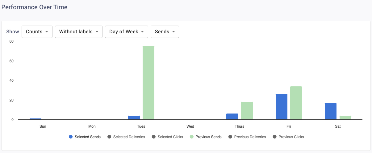
Day of Week
This displays a column chart that summarizes the metrics by day of week.
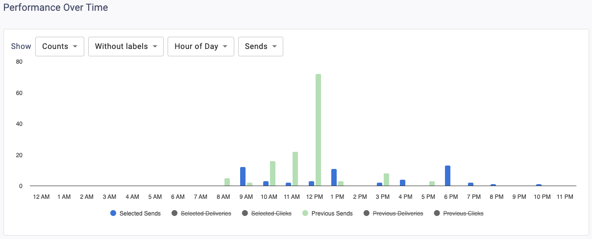
Hour of Day
This displays a column chart that summarizes the metrics by hour of day.

Performance Metrics Table

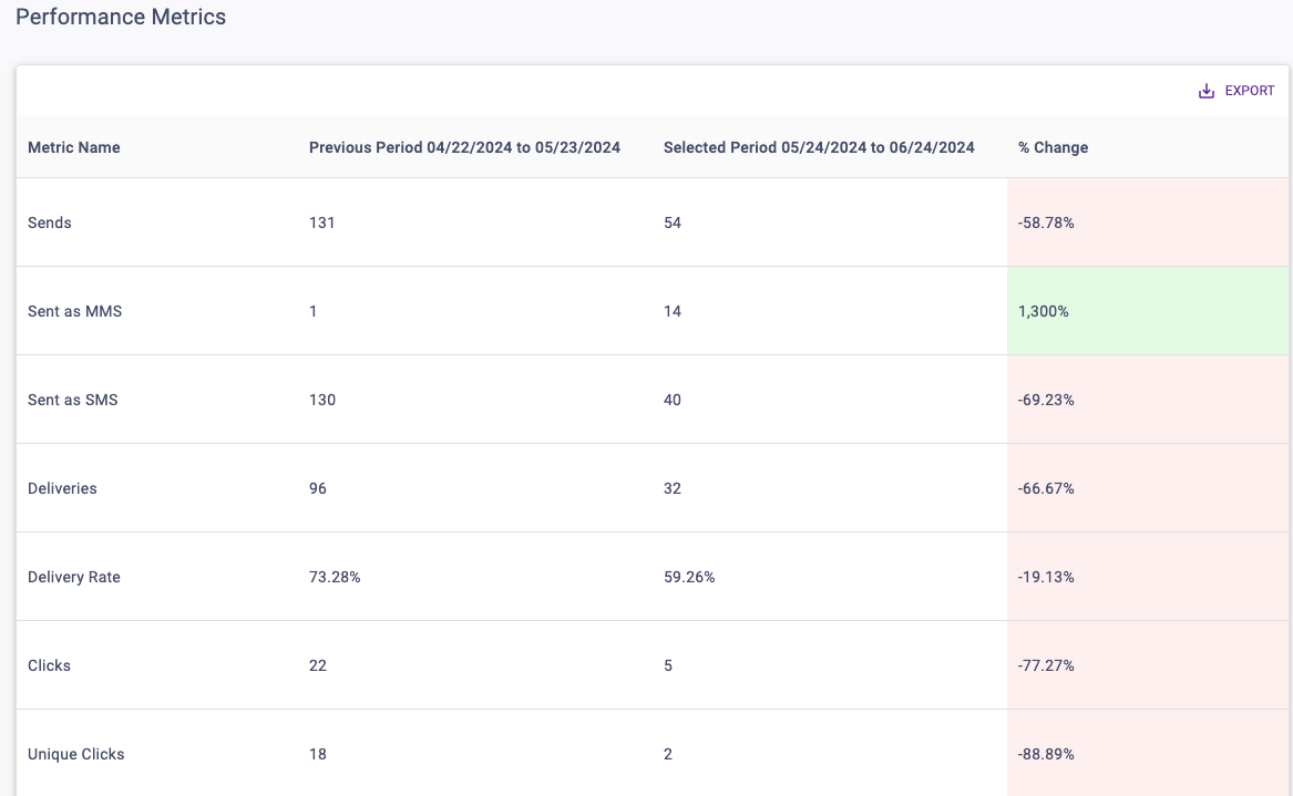
Metrics are displayed for both the Selected Period and the chosen Comparison Period. The % Change column calculates the difference between them and has color shading for positive (green), negative (red), and neutral (grey) changes. The infinity sign (∞) will return for any percent change where the Comparison Period value is 0 and the Selected Period value is greater than or equal to 0.

Top Performers Tables

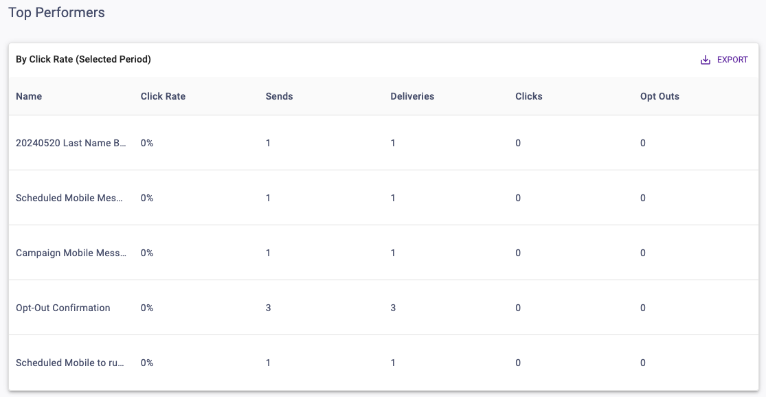
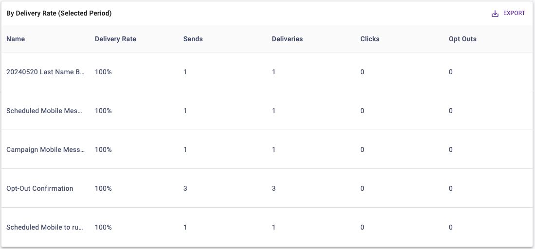
These tables will display the Top 5 communications ranked by Click Rate or Delivery Rate for the Selected Period.

Updated on June 25, 2024

Was this article helpful?

Related Articles