By viewing the Sales report, it’s easy to view a variety of metrics regarding your campaign all at once, from transaction amounts and transaction size to the number of unique customers- and more! You’ll be able to see a summary of how your campaign is doing in terms of customer transactions and sales at a glance.
The available metrics in this section include the following:
- Total Transactions (checkouts minus voids)
- Identified and Unidentified Transactions
- Basket Size (number of average items per transaction)
- Total Net Sales
- Identified and Unidentified Net Sales
- Avg Net Sale Per Transaction
- Total Discount
- Avg Spend (per unique customer)
- Unique Customer Count
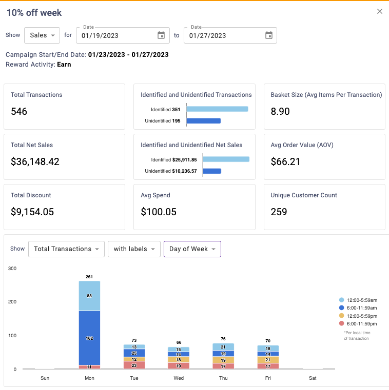
“Show” Dropdown
Using this dropdown you can visualize the following metrics:
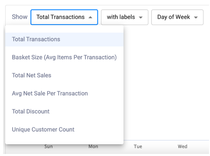
- Total Transactions
- Basket Size (average items per transaction)
- Total Net Sales
- Avg Net Sale Per Transaction
- Total Discount
- Unique Customer Count
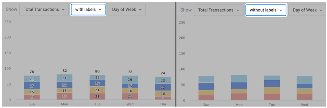
With or Without Labels
This dropdown is used to toggle whether data labels will appear on the graph or not. Selecting with labels will display a more detailed graph containing labels, while selecting without labels will display a cleaner graph.
Timespan Dropdown
The third dropdown determines the timespan of the chart. It can toggle between Day of Week, Month, or Timeline.
Day of Week: This displays a stacked column chart that breaks metrics out by the day of the week and time of day. Metrics are assigned to the time of day groupings according to the local time of the transaction. For example, if you have a location in New York and a location in Los Angeles with transactions that occur at 8am local time for each location, both would be assigned to the 6:00-11:59am group.
Month: This displays a trend over time chart that summarizes metrics by month.
Timeline: This displays a trend over time chart that plots metrics by day. The bar on the bottom of the chart can be used to zoom in or out to different date ranges on the timeline. All data for the selected date range will be displayed.

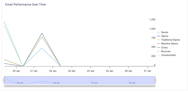
You’ll be able to view how often and when certain actions occurred to the email associated with the campaign.
Example: You have an active campaign that sends users a $5 reward for their birthday. You want to view how this campaign is doing by seeing how often members open this campaign email.
The available available metrics in this section may include the following:
- Total Sent
- Open Rate
- Click Rate
- Opens
- Traditional Opens (opens by a user without mail privacy protection)
- Machine Opens (opens by a machine with mail privacy protection enabled)
- Bounces
- Unsubscribes
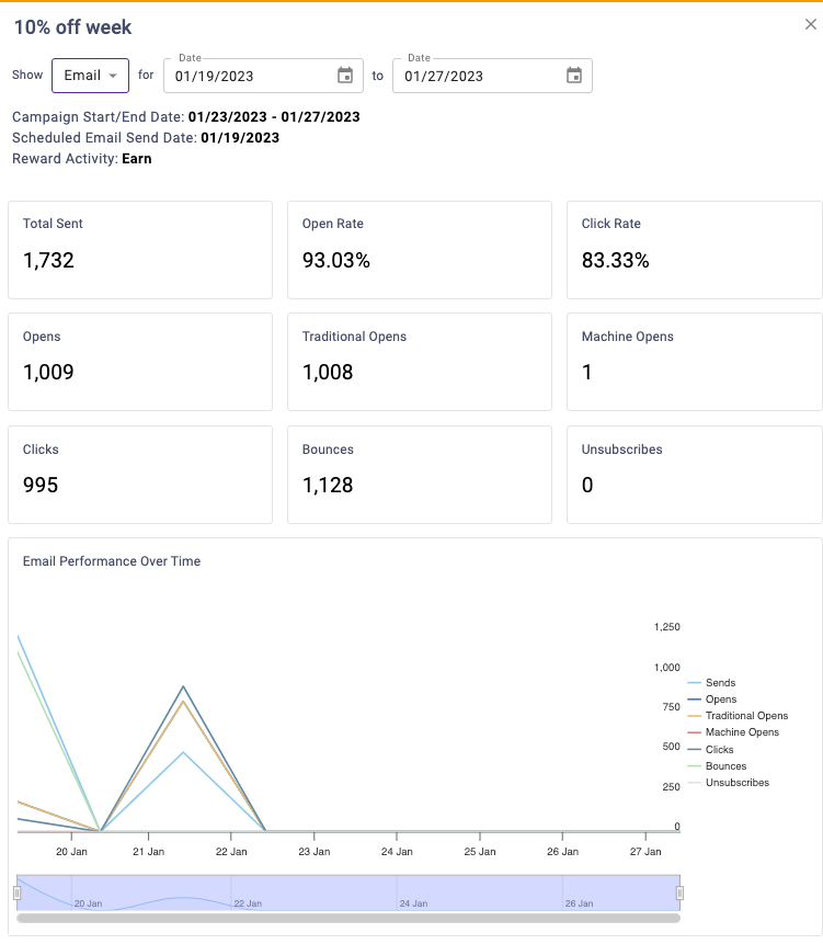
The graph will plot each metric (Total Sent, Opens, Clicks, Bounces, and Unsubscribes) by day for the reporting period. If you want to show/hide any of the legend items in the graphs, you can do so by clicking on their name. You’ll also be able to adjust the date by using the slider below the graph.
You’ll be able to see what rewards customers earned related to this campaign, as well as the amount of rewards they used up, or burned, if applicable.
Earn Example: You may have set up a campaign where a customer is able to earn double points for a limited period of time, or give a customer 100 points when they enroll in your loyalty program. You’ll be able to see how many rewards the customer earned during this time period.
Burn Example: You may set up a campaign to drive frequency by rewarding customers who have visited enough times to qualify for a free product, such as a free coffee. This section will show the amount of punches redeemed towards this campaign.
The available available metrics in this section may include the following:
- Total Rewards Earned
- Total Rewards Burned
Note: The burn section will not show for campaigns that use universal banking rewards like points that are part of your overall loyalty program. This is because redemption cannot be tied back to the specific campaign. The earn section will not show for banking redemption campaigns because they burn only.
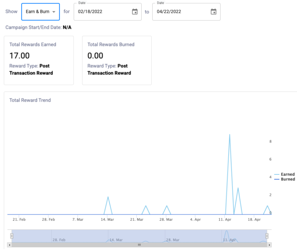
The graph will plot each metrics by day for the reporting period. If you want to show/hide any of the metrics on the graphs, you can do so by clicking on their name in the graph legend.
Date Range
The reporting date range defaults to the last 6 months including the current date unless another range is chosen using the calendar widget. Non-limited time campaigns, as in campaigns without a start or end date, however, will show a date range as to when the campaign was created.
Note: If the campaign has a defined start or end date, you cannot select dates outside of those dates.