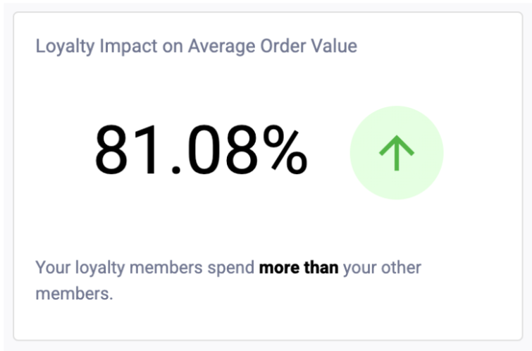
This visualization displays the percent difference between your Loyalty Average Order Value (AOV) and Other AOV over the entire reporting period.
At a glance, you’ll be able to see if the average order value for your loyalty members is higher, lower, or equal to other members.
Note: If only one of the values is zero (0), the percentage will be replaced with an infinity sign (∞), the arrow will point up or down indicating whether Loyalty AOV is higher or lower and the message below will indicate which AOV is higher.
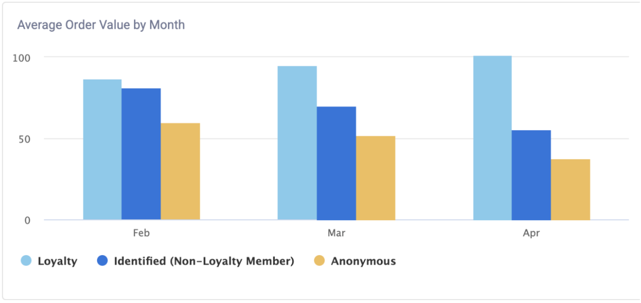
This visualization displays your Average Order Value (AOV) broken out by Loyalty Status and by month. It will display Loyalty Members, Non-Loyalty Members, and Anonymous Members.
You will be able to click on the keys of the graph in order to make each section appear or disappear. Additionally, you can hover your mouse over the bars to view the specific numerical values.
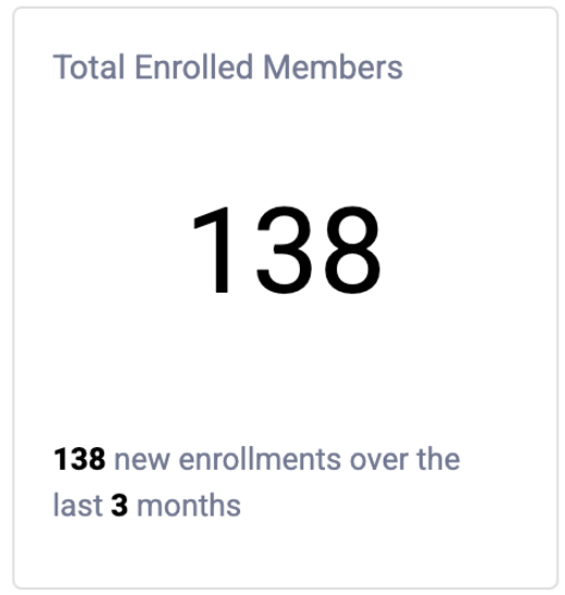
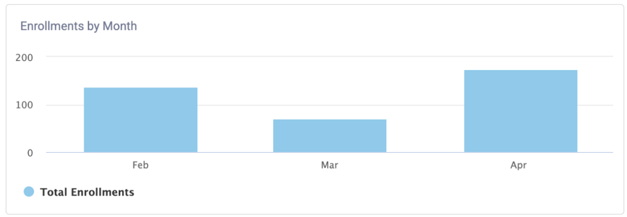
This visualization displays your current total loyalty membership. The message below displays the total new enrollments for the reporting period.
This visualization displays your new loyalty enrollments broken out by month over the past 3 months. You can hover your mouse over the bars to view the specific numerical values.
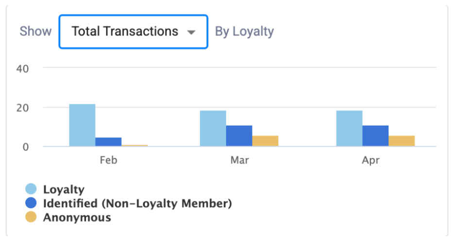
This visualization allows you to display a variety of options based on Loyalty. From the dropdown, you’ll be able to select Total Transactions, Total Net Sales, or Basket Size (the number of average items per transaction) broken out by Loyalty Status and by month, going back to the last 3 months.
You will be able to click on the Keys of the graph in order to make each section appear or disappear. Additionally, you can hover your mouse over the bars to view the specific numerical values.
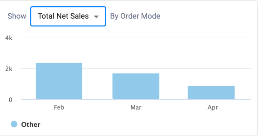
This visualization allows you to display your Total Transactions, Total Net Sales, and Basket Size (Avg Items Per Transaction) broken out by Order Mode and by month. You can hover your mouse over the bars to view the specific numerical values.
Note: This chart will be vary depending on how your brand is set up. Your brand’s order mode will be displayed on this chart with corresponding data.
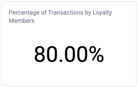
This visualization displays the percentage of your total transactions (checkouts minus voids) completed by Loyalty Members for the reporting period.
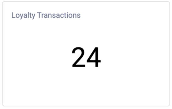
This visualization displays the number of transactions completed by Loyalty Members for the reporting period.
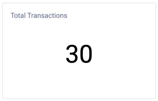
This visualization displays the total number of transactions completed during the reporting period, including Loyalty and Non-Loyalty Members.